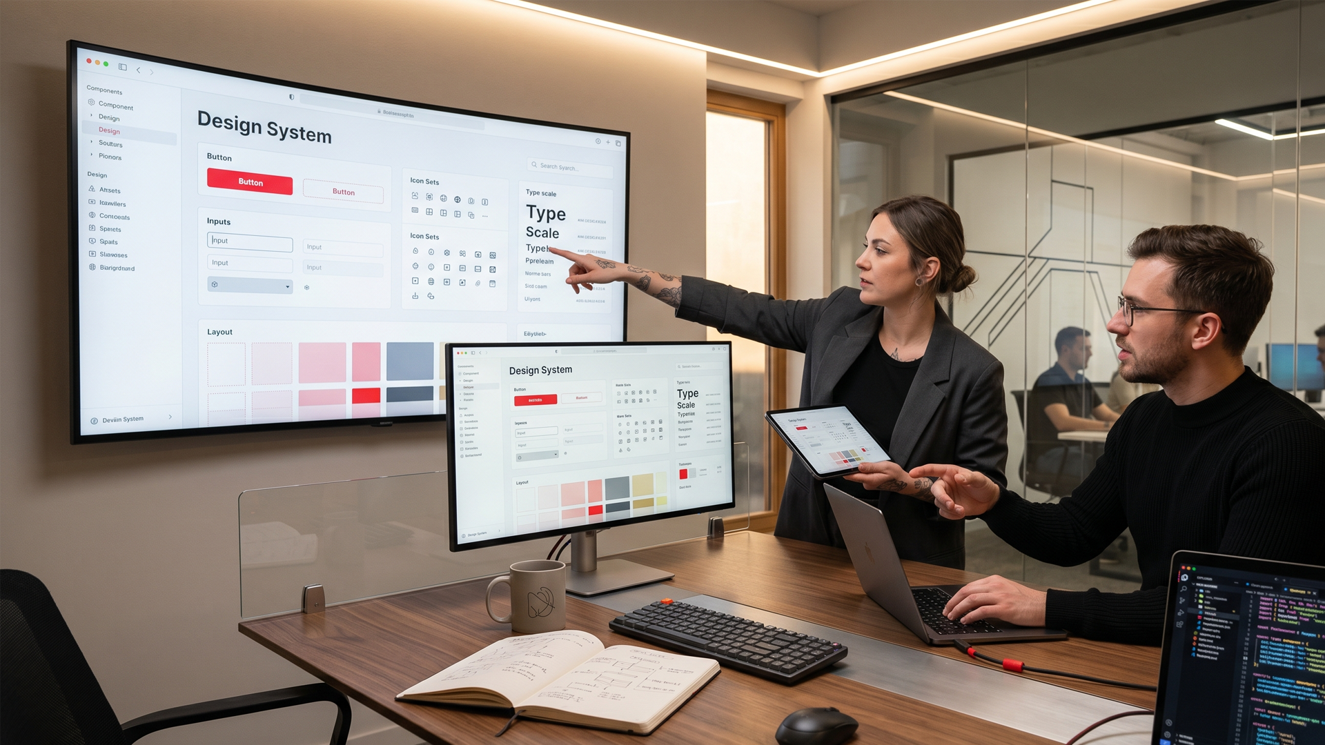
Component libraries, tokens, and documentation for consistent product UI at scale with Figma-code sync, adoption plans, and accessibility baked into primitives.
Design systems unify buttons, forms, tables, and patterns in Figma and code with Storybook documentation and contribution models scaling design and engineering together. Color, spacing, and typography tokens flow from design tools to production, and legacy screen migration is supported incrementally not requiring a big-bang rewrite. Component-level accessibility ensures consistency without per-screen audits.
Tokens and Components That Sync
Color, spacing, and typography tokens flowing from Figma to React or your stack.
Automated checks detecting drift between design files and production code.
Single source of truth preventing designers and developers from diverging.
Component APIs documented for consistent implementation across teams.
Design-development parity maintained as the system evolves over time.
Adoption Plans, Not Drop-and-Run Libraries
Migration guides help legacy screens move to the system incrementally, with office hours supporting teams during initial adoption phases. Lint rules enforce system usage in code reviews automatically.
Champions programs identify power users who accelerate org-wide adoption sustainable adoption, not a library that sits unused in a shared folder while teams keep building one-off components.
Accessibility Baked into Primitives
Focus states, contrast ratios, and keyboard patterns are defined at component level with screen reader behavior consistent across every instance. Accessibility fixes propagate system-wide not per-page patchwork.
WCAG compliance built into foundations reduces audit remediation scope, delivering inclusive product UI by default rather than as a retrofit project six months after launch.
Governance for Contributions
RFC process governs proposing new components or token changes, with review cadence preventing duplicate or conflicting pattern proliferation. Versioning strategy communicates breaking changes to consuming teams clearly.
Contribution guidelines enable scale without sacrificing quality living systems that grow organized, not chaotic, as product complexity increases.
What you can expect from us
Step 01
Strategy
We plan with purpose, turning your goals into a clear roadmap.
We learn your business, audience, and goals, then shape a focused plan for what to build first.
Business analysis
Clear priorities
Phased roadmap
Step 02
Creativity
We bring fresh ideas and modern design so your product stands out.
Interfaces, visuals, and interactions are shaped to feel distinctive, clear, and true to your brand.
Distinctive design
Clear interactions
Brand-fit visuals
Step 03
Execution
We turn plans into reliable results, delivered with care and on time.
Design, engineering, and QA move in short cycles so progress stays visible and releases stay dependable.
Focused delivery
Quality checks
On-time releases
Step 01
Strategy
We learn your business, audience, and goals, then shape a focused plan for what to build first.
Business analysis
Clear priorities
Phased roadmap
Step 02
Creativity
Interfaces, visuals, and interactions are shaped to feel distinctive, clear, and true to your brand.
Distinctive design
Clear interactions
Brand-fit visuals
Step 03
Execution
Design, engineering, and QA move in short cycles so progress stays visible and releases stay dependable.